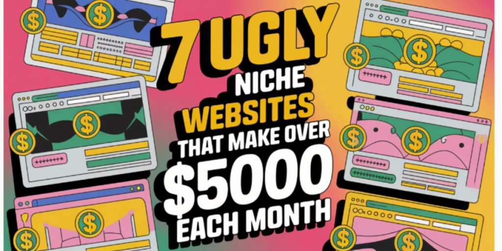
How This Ugly Website Makes $5000/Month?
When people think of successful websites, they often imagine sleek, modern designs with high-end visuals. However, the reality is that some of the highest-earning sites on the internet look outdated, cluttered, or just plain ugly. Despite their appearance, these ugly niche websites pull in over $5,000 each month, proving that function often outweighs form in the online world. In this article, I’ll take you through the secrets behind these ugly but highly profitable websites, breaking down how they make money and what we can learn from them.
Why Ugly Niche Websites Still Make Money
At first glance, an outdated or unattractive website might seem like a failure. However, the truth is that an ugly website can still thrive if it provides value, solves a problem, or delivers an essential service. The reason these websites work is simple: people care more about the content and functionality than the aesthetics. If a website fulfills a need, users will keep coming back, even if the design is less than ideal.

Take Craigslist, for example. Its minimalist, text-heavy design hasn’t changed much since 1995. Yet, it continues to dominate the classifieds market, making millions in revenue. The platform is simple to use, loads quickly, and delivers exactly what users are looking for—buying and selling local goods, finding jobs, and posting services. Craigslist’s success proves that usability and content matter more than flashy design elements.
Monetization Strategies of Ugly Websites
These websites generate thousands of dollars each month through various monetization methods. One of the most common strategies is advertising. High-traffic websites, even if they are unattractive, can make significant revenue through ad placements. Google AdSense, banner ads, and sponsored content allow website owners to turn traffic into income.
Another powerful revenue stream is affiliate marketing. Websites that review products, provide recommendations, or publish niche content can earn commissions by linking to external platforms like Amazon, eBay, or other affiliate networks. Even if the design is outdated, as long as the content provides real value, users will click on those links and generate income for the site owner.
Subscription models also play a huge role. Some ugly websites offer exclusive content or premium memberships that provide additional benefits to paying users. Take Plenty of Fish (POF) as an example. Before its redesign, POF had a cluttered and outdated layout, yet it was one of the biggest dating platforms in the world. The key to its success was offering a free service with an option to upgrade for premium features. People weren’t concerned about the look of the site; they wanted access to potential matches.

1. LingsCars.com
LingsCars.com is one of the best examples of an ugly website that thrives financially. The chaotic design, neon colors, and excessive animations make it look overwhelming. However, this unique branding grabs attention, keeps visitors engaged, and ultimately converts them into paying customers. Ling Valentine, the website’s owner, uses humor, personal branding, and an aggressive marketing strategy to dominate the car leasing business in the UK.
Her site proves that being different—even in an unusual, visually chaotic way—can help a business stand out in a crowded market. She uses trust signals such as customer reviews, awards, and transparent pricing to build credibility. The takeaway? A memorable and engaging experience, even if it’s unconventional, can drive traffic and sales.
2. Drudge Report
Drudge Report is a classic example of an ugly yet incredibly profitable website. Its plain, text-heavy layout looks straight out of the early 2000s, but it generates millions in ad revenue. The site aggregates political news and links to external sources, drawing massive traffic daily. The lesson here? Content and audience engagement matter more than design.
3. Plenty of Fish (Before Redesign)
Before its redesign, Plenty of Fish (POF) was one of the ugliest dating sites online. The basic layout, cluttered design, and outdated user interface didn’t stop it from becoming one of the largest dating platforms globally. What made it work? A free-to-use model, strong matchmaking algorithms, and effective monetization through ads and premium memberships.
4. Craigslist
Craigslist hasn’t changed much since its launch in 1995. The site remains minimalistic, text-heavy, and entirely devoid of visual appeal. Yet, it continues to dominate the classifieds market, making millions in revenue from paid job postings and featured listings. Its simplicity and functionality keep users coming back, proving that a strong value proposition beats fancy aesthetics.
5. The Million Dollar Homepage
This website is literally just a grid of 1,000,000 pixels sold as advertising space. Created by Alex Tew in 2005, it might be one of the ugliest money-making concepts ever. Despite its odd approach, the site generated over a million dollars, proving that creativity and viral marketing can lead to massive profits.
6. Text-Only Blogs Like The Best Page in the Universe
Maddox’s blog, The Best Page in the Universe, is an example of an ugly, text-heavy website that still managed to make thousands per month through book sales, merchandise, and advertising. The site’s popularity comes from strong, opinionated content rather than a polished design. If you have unique insights and a bold voice, you don’t need a flashy website to make money.
7. Neopets (Before Redesign)
Neopets was one of the most visually cluttered and outdated gaming websites on the internet before its redesign. Despite its chaotic user interface, it attracted millions of users who spent hours playing and engaging with the platform. The site profited heavily through in-game purchases, advertising, and branded partnerships.
The Power of Content and SEO
Another reason ugly websites succeed is their focus on content and search engine optimization (SEO). A website doesn’t need a sleek design to rank on Google—it needs high-quality content that answers users’ queries. Blogs with valuable insights, how-to guides, and well-researched articles can attract consistent organic traffic. The more traffic a site receives, the higher the chances of monetization through ads, affiliate marketing, or digital products.

For example, text-heavy blogs like The Best Page in the Universe rely on compelling content rather than aesthetics. The site owner, Maddox, built a cult-like following through opinionated, controversial, and humorous writing. Despite having a simple layout, the blog generated substantial income through book sales, merchandise, and online advertising.
How You Can Apply These Strategies
If you have an outdated website or are thinking of starting one, don’t worry too much about design. Instead, focus on:
- Providing Value: Make sure your content solves a problem or fulfills a need. Users will forgive an ugly design if they find your site helpful.
- Monetization Strategies: Learn from successful ugly websites and implement advertising, affiliate marketing, or subscription models to generate revenue.
- Marketing and SEO: Even the most unattractive site can rank high if you use proper SEO techniques, create engaging content, and attract backlinks.
Bonus Tip: How to Make an Ugly Website Work for You
If you have an outdated or unattractive site, don’t stress. Instead, focus on:
- Providing Value: High-quality content and services will keep users engaged.
- Monetization Strategies: Learn from these successful sites and optimize your revenue streams.
- Marketing and SEO: Even an ugly website can rank high if you use proper SEO techniques.
Final Thoughts
Ugly doesn’t mean unsuccessful. As long as a website provides value, attracts traffic, and has a solid monetization strategy, it can generate thousands of dollars per month. If you’re worried about the look of your website, shift your focus to user experience, content, and revenue strategies instead. Who knows? Your “ugly” website might just become the next big success story.